
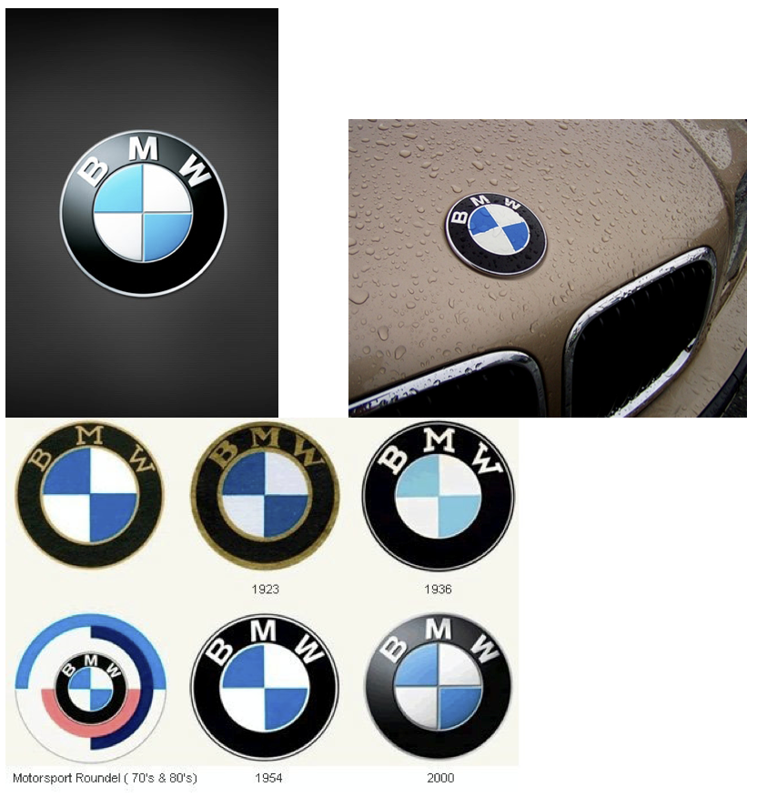
The BMW logo
Logos are all around us whether we realize it or not. A logo that we are for sure to see on a daily basis is a car logo. They all have a certain appeal to the public and establish an image for the company as well as describe the company. A logo I think that does a good job is the BMW logo.
Although the BMW company didn’t start off as a car manufacturer, it has definitely had an impact on the world of automobiles. The BMW company is known for elegance and maintaining a top-notch performance with their car designs and technology. Even thought the logo has changed over the years, it has been a stable and firm logo. The BMW logo is a recognizable and an accurate descriptive logo of the BMW firm. With the silver outer ring to the bold black ring, the inner blue and white colors, to the typography, this logo is the company. The typography used fits the style perfectly and also contributes to the pictorial part of logo in showing what the BMW firm is all about.
I find this logo appealing and helps in showing that logos don’t always have to be complicated, but that simplicity can communicate a strong message just as good, or sometimes even better. Hopefully, I can one day I can get my own BMW and see the logo everyday, as well as appreciate a classy, elegant, awesome car.
Like I said when I commented on Lance's post on BMW's ad campaigns, BMW is one of my favorite car brands. I'm so glad you decided to highlight their logo! It's so simplistic, but does an excellent job of maintaining a sporty and classy feel. That's a lot to accomplish in logo, but I feel like they've done it (and consistently maintained it) throughout all their logos.
ReplyDelete