Thursday, September 30, 2010

Words of the Week.

I think I am stuck on typography, but there are just so many fun word. Did you know that many point sizes have their own name. It’s true, here are a few:
Brilliant: A traditional term for a type size of 3.5 points. (You would have to have brilliant eyes to be able to see words that small.)
Canon:  A traditional term for a type size of 48 points.
Minion: A traditional term for a type size of 7.3 points. (I wonder why someone might set something in 7.3pt. instead of rounding it down to 7pt.)
Minikin: A traditional term for a type size of 3 points. (I think this is my personal favorite.)
Bourgeois: A traditional term for a type size of 8.5 points.
Brevier: A traditional term for a type size of 7.6 points.
Excelsior: A traditional size of type of about 4 points, or half the size of brevier
Great Primer: A traditional term for a type size of about 18 points.
Long Primer: A traditional term for a type size of 9.5 points.
Nonpareil: A traditional term for a type size of 6 points. The name is still sometimes used as an alternative term to indicate 6-point leading.
Paragon: A traditional term for a type size of about 20 points, originating in 16th-century Holland. It was also described as a two-line primer.
And then there are the prescious stones…
Gem: A traditional term for a type size of 4 points.
Pearl: A traditional term for a type size of 5 points.
Ruby: A traditional term for a type size of 5.5 points (this is also called an agate. I know you will impress your typography teacher if you use these these terms when talking project solution.)


Wednesday, September 15, 2010

The R-Word


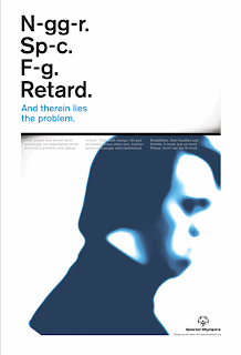
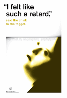
In the last post, Goehner talked about the 6 questions you should ask when evaluating a social awareness poster. I chose to post this campaign by the Special Olympics to challenge people not to use "retard" as slang because I think these posters are an excellent example of all 6 points.

1. Attract the attention of a viewer.

This poster definitely grabs your attention. Sure it's mostly by shocking you, but shock is a proven method in social awareness campaigns. The key is to shock with a purpose.

2. Hold the viewer’s attention long enough to read the content.

Because the text is so shocking it makes you curious to know their point and you keep reading. Notice though that there still isn't very much small text, just enough to explain and drive the point home. No one is going to stand there and read a huge block of tiny print, no matter how fabulous your hook is.

3. Evoke an emotional response.

The comparisons these posters make between retard and other offensive words you would never say makes you think of all of the times you've used retard that way. It's personal and convicting.

4. Encourage action.

The emotional response makes the challenge is immediate and clear: stop saying retard.

5. Give the viewer adequate information to act.

Since the action they are trying to evoke is immediate they don't have to provide extra information. By making you feel the offensiveness of the word they provided you with the information you needed. You don't have to go to a website or make any extra step at all which is why you're more likely to act.

6. Give the viewer something to take-away to contemplate.

I found this campaign a year ago when I was researching for my Graphic design 2 social awareness poster and I'm still contemplating it a year later... Impressive. Again, it's all in the emotional response.

The effectiveness of this campaign really is all tied to the emotional response it creates. It's what makes the poster memorable, it's what makes someone want to act, it's really what makes our poster worth anything. Clever style will never make up for lack of content in a social awareness poster. The style of these posters isn't particularly clever or original or emotional, but that's beside the point. What matters is that I remember these posters a year later and haven't said retard since.

How to impress your typography teacher.

Word-of-the-week: This week, I thought I would give you a few words with which to impress, and “dazzle,” your typography teacher, and your peers. Try them out in class.
Dazzle: A colloquial term describing the visual effect caused by exaggerated differences between widths of strokes in a letterform.
Full Face: (No this is not when you have just stuffed your face with “Pie” after lunch, creating “Fat matter” around the waste.) It is a headline type, always in capitals. Also called “Titling.”
Pie: Traditionally, composed type that has been inadvertently mixed up.
Fat matter: A traditional term for typeset copy that is easy to set because it includes a large degree of spacing. Dense — thus difficult — copy is known as lean matter.
Have fun with these. I will have more typographic terms throughout the semester. 
 

Thursday, September 9, 2010

PAWS FOR A CAUSE

I was browsing social awareness campaign posters and came across this campaign for the RSPCA (Royal Society of the Prevention of Cruelty to Animals, www.rspca.org.uk) The posters make the statement “Animals can’t protect themselves,” then provide the viewer imagery the gives a humorous twist, capturing the viewers interest. The posters caught my attention right away. Visually they are very appealing with striking imagery, a direct message, and a clear concept. Something about dog always catch my attention, it may be just because I love dogs, be-that-as-it-may, these ads are effective. To speak to there effectiveness, I have asked my wife (a veterinary technician) to talk a little about them. 

“These posters are pretty brilliant. The photographer captured that perfect helpless look on the dogs’ faces, and the idea of them trying to use these weapons furthers the viewer’s desire to help the poor pups. The almost immediate response is “What do I need to do?” As an added bonus, I just can’t stop thinking about that silly chocolate lab going Chuck Norris on a rabid raccoon.” —Heather


The posters provide us with a selling point which states: “The RSPCA needs money to continue their great work protecting, housing and healing animals. Visit our website to see how we’ve put the fun into fundraising. www.pawsforacause.com.au”

To evaluate whether these posters are effective we should ask if the poster accomplishes the following, do they: 

1. Attract the attention of a viewer.
2. Hold the viewer’s attention long enough to read the content.
3. Evoke an emotional response.
4. Encourage action.
5. Give the viewer adequate information to act.
6. Give the viewer something to take-away to contemplate.


Watch out for Bastards

Word-of-the-week: Bastard


There are three different categories for this week’s word-of-the-week. 


1.) TYPOGRAPHY
Bastard: “Of type, a character that is foreign to the font in which it is set (such as a gliph used from a different font set.) Also, in mechanical typography, a character that is smaller or larger than the body upon which it was cast.” (Example: Bastard.)
2.) PAPER
Bastard: “Generally, any nonstandard size of sheets of paper. Also, specifically an obsolete paper size of 33 x 20 inches.”
3.) PRINTING
Bastard: “Any aberration or abnormal element in the printing process.” 
My advice for you this week is to watch out for Bastards. They can cause trouble. 

Wednesday, September 1, 2010

Social Concern & Poster Design

The first project that the Graphic Design 2 students will be working on focuses on designing for a ”social concern.” The objective of the project is to teach students  how to develop a social voice through their design work using poster design as a delivery method. By focusing on ‘Content’, ‘Context’, and ‘Concept’, the students will design a poster expressing a social concern close to their heart. Understanding the context of the message is an important part of developing an affective conceptual solution that will connect with the hearts of the viewer. 


Recently, I was looking through the November/December 2009 of Communication Arts magazine. The issue is their Design Annual 50, looking at 50 years of design. I came across a brilliant ‘public service’ anti-war poster campaign for the School of Visual Arts, Art Director: Jeseok Yi (New York, NY) Creative Directors: Frank Anseimo/Alfred S. Park/Richard Wilde, and Writers: Francisco Hui/Willaim Tran. 


This is what the designer said about the campaign:


“We came up with a simple and elegant outdoor poster campaign that focused on the spiraling cycle of war. It reminds viewers that the violence perpetrated abroad will breed the hatred that fuels tomorrow’s violence—what goes around, comes around. To achieve peace, we must end violence…”


The poster campaign relies heavily on the distribution context to communicate the concept successfully. The 100"x60" posters are designed to wrap around  pillars to present the full meaning of the content. When the posters are flat a viewer would see a image; of a man shooting a gun, or throwing a grenade, at some undisclosed target in the distance, but when wrapped around a pillar the target becomes the one actually shooting the gun or throwing the grenade, reinforcing the idea that “what goes around, comes around.”


The designers understood their environmental context and developed a concept that would reinforce the cyclical idea of war. The text on the poster “What goes around, comes around,” is broken up and confusing when flat, but when placed on a pillar, the text comes together to work. The poster is simple, elegant, and convicting. It reaches the heart of the viewer and successfully voices the concerns of the designers.

It’s a Dummy

Word-of-the-week: “Dummy”


This week in Graphic Design 2, we have been talking about craftsmanship, presentations, and mock-ups, so I thought that “Dummy” would be a fitting word for this week. 
Dummy: A mock-up of a design, such as book, poster, or packaging, showing the position of headings, text, captions, illustrations, and other details.
It is a good idea to create a “Dummy” for each print design project. A “Dummy” will give you a true sense of how a design will look, read, and feel, when completed. I have a confession; there have been several times, throughout my design career, that I have not created a dummy when I should have, and I have paid for it later in the process. When building the final mock-up to show the client, I quickly found the design not working as intended, oops. This forces me to rush a redesign that would work, wasting valuable time. So instead of creating a “Dummy” I was a dummy. 


My advice for you is: Don’t be a Dummy. Make a “Dummy” instead.