Thursday, December 1, 2011

Michael Kerby’s Post


When I think of shocking design I think of Adbusters.  Although I can’t say I completely agree with everything they have to say, I must admit that they effectively shock viewers through their design.  There is almost alwasy a clear and concise message that is being portrayed.  Usually that message relates to consumerism.

That is the case for both of the ads included today.  There designs are often clean and to the point.  In the design with the Ipad, they very effectively use white space to draw your attention to the young boy and ipad.  With the other, they use lots of color to draw the viewer in.  Both ads use graphics that the viewer is familiar with in order to grab the attention of the viwer.  Both ads are very effective and shocking.  This is the kind of design that makes me stop and think for a second.  


Danielle Dye’s Post

Advertisements, done well, on the sides of buildings are an effective and interesting way to get the information across. I thought this Nike ad was such a neat idea. It's effectively getting across the idea that these are swift running shoes and with the appearance that the windows are effected by the shoe going by, makes it even better. The size and location of an ad like this isn't going to be missed. People would notice that the windows seem out of wack on this building and that would draw them in.  

At first glance I figured this second advertisement was an ad for paint, but in fact, it's an ad for Nationwide Insurance. I thought this was a really clever way to show that life does "come at you fast". Anyone going by definitely wouldn't miss this advertisement. With the yellow cars at the bottom, it really does look like paint spilled down the side of the building. Using the three banners was a really interesting and effective way of using the sections of the building. Effective advertisements on the sides of buildings like these are definitely memorable.


Jay Vogt’s Post


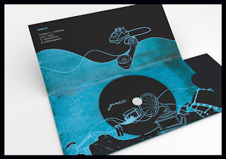
I ran across this brochure that was created for the Genesi company and was really intrigued. The first thing I noticed was the idea to integrate the CD into the artwork of the entire design. I looked up the company and found their website (http://www.genesi-usa.com) and I feel that, although the color scheme of the brochure is obviously different, it still conveys the same message that the company wants to convey with their website: a clean-cut, modern tech company that's constantly
thinking of innovative new ideas. 

Back on the critique of the design, I love the choice to stick with shades of black and shades of blue, instead of going all out with color. I love the idea on the front cover that has "MADE IN genesi," fairly subtle and great in conveying the company. Also, the quote on the cover was an excellent idea too! 

When you open up the brochure, I love the simplicity and the creative designs depicted in the brochure. It has the basic information located in the corner of the brochure and then has a CD and a pocket containing what I would assume is more detailed information. I think in a company that deals primarily with the digital age, it makes sense to have a lot of the information on a CD readily accessible with the brochure. I like the pocket design, as it is subtle and clean cut, but still obvious once the brochure is open. 

The last part of this over all design I thing is an out-of-the-box idea, while still being a box! (no pun intended.) This guy was looking ahead at where this brochure would be distributed and thought to create a box that can be used to store stacks of these brochures for handing out. Not only did he make functionality out of it, but he also was able to incorporate more information plain to see on the box. 

Daniel William’s Post

The use of negative space in design is one of the strongest things a designer can do. Negative space is often very subtle and very aesthetically pleasing. Simple use of negative space seems like a very simple thing, but it is not the easiest thing to accomplish. A designer must be clever when trying to make creative use of negative space. Every part of design should be deliberate, but especially so in designs such as the examples. The designer must be looking for how to change a seemingly plain design into a clever design that is memorable.
The Logo that says "NEGATIVE SPACE" is simple and would be fairly boring if it were not for the hidden "E" between the N and G. The same goes for the "BLACK CAT" logo. It is a simple typographic logo with nothing special, but with the the cat's eyes forming the C's it makes it exponentially a better design.


Morgan Henson’s Post

One thing I've been noticing lately is how so many companies are beginning to recreate or "rebrand" themselves, either to keep up with the times or create a new identity for themselves. I've found plenty of examples lately but these are the ones that stuck out to me the most.

The first one is the Florida Marlins major league baseball team, newly renamed the Miami Marlins. In my opinion, there is no better time to rebrand than when the company changes names. 


Although the new logo slightly resembles the Super Mario M, I am convinced that this new logo will be very effective and distinct to the team.

I am sure that we are all familiar with the second one: AOL Instant Messenger. Honestly I was not aware that AOL was even in existence, but it appears that with their new logo they are trying to stay afloat! I do enjoy the new logo and it is much more modern, but I will miss the yellow buddy.

I have conflicted feelings about the new Doubletree logo. When I first saw it advertised in Springdale, I remember initially thinking that it was terribly ugly. But after looking at the old one I cannot decide which one is better (or worse!) The new one is definitely more noticeable than the original, but that may not necessarily be a good thing. However, I do think that it is wise that they associate themselves with Hilton Hotels, which they successfully do with the "by Hilton" placed strategically underneath. There are plenty more examples of companies recreating themselves (and many, many opinions on them) at http://www.underconsideration.com/brandnew/

Wednesday, November 30, 2011

Kara Underwood’s Post

I think this brochure works perfectly for the company. From what I can tell, Ben Sen Inc. is a design company and manufacturer of furniture. If you go onto their website http://www.bensen.ca/ the photos displayed are in a square format, just like the square brochure. I think that's very nice. I also like the square format of the brochure because a lot of their furniture pieces has a square design incoporated into it, so that fits together very nicely. Another aspect I love about this brochure is that all it has on the front is the logo and then the die cut framing it. If I saw this brochure laying around, I would really want to open the brochure up to find out what the brochure is about. Then you open the brochure up, and they have a lot of white, which looks very nice and clean. They have enough text but no too much. The photos are the main focus and the product is displayed as the main focus.


Troy Rogers’ Post

This information design poster really caught my attention. I typically don’t like posters, but I am seriously considering buying one of these. They picked a very relevant topic that would interest a lot of people, and then they made a very clear and bold design that easily catches people’s attention. The colors are all very fitting for the topic since they are similar to the original Apple logo, and the information in the design is very easy to follow. Also, they were able to fit in a lot of information without it feeling cluttered. I would definitely consider this to be one of my favorite information design pieces.

Tuesday, November 22, 2011

Brochures

Brochures;
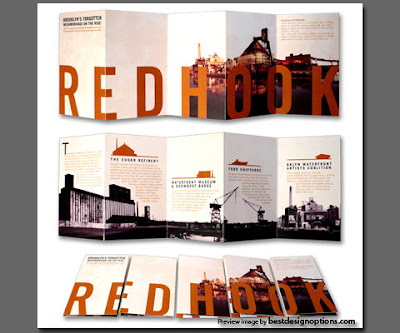
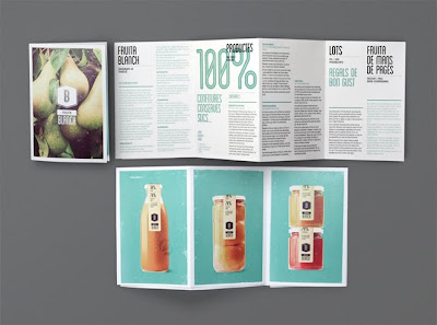
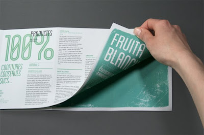
The most common types of brochures are bi-fold - which results in 4 panels, and tri-fold which results in six panels. As with all other design, it is important to keep in mind your audience, who are you trying to give information to with this brochure, this should largely impact how you design. Further, with brochures it is important to use graphics of imagery to draw people in, a brochure filled with text and nothing visual pleasing will not get picked up. So think of the audience and what style will draw that audience in. They are informational but they are also interesting.

Here are some examples of brochures that I really liked and that really grabbed my attention

Monday, November 7, 2011

Danielle Schindler’s Post

I came across several different information design posters that had interesting information in it, but for some reason, the one with the ice cream caught my attention. This information design looks like a old fashion Diner Menu because of the font, the graphics, and even the color choices. But when you look closer, you see that it is a guide book to make certain frozen desserts. Something that I appreciate about this poster is the overall theme of it, and I also appreciate how the designer did not just tell you what is in each dessert, but rather, the designer made  the dessert much like a chart. They individually broke up the ingredients of each dessert so one can see that ratio of how much of one item to put into their dessert. This chart does not have any life changing information on it, but I think it is a simple, fun, and interesting way to share how to make some of peoples favorite desserts.

Thursday, November 3, 2011

Charity Brochures

Charity Brochures
I find this brochure at the mission fair table at JBU, I find that often charity brochures (especially for missions) are not well designed. However, when I saw this one it immediately grabbed my attention. The information was laid out in a well designed, interesting way with colors and typographical hierarchy to help grab your attention. It has a nice use of imagery and graphic elements to help make the information more interesting and finally the pictures on the back make it more personable.
When creating brochures for charity one thing that i find to be important is pictures, pictures automatically draw people in and make the brochure more appealing. I find that often people slack when creating brochures for charities, but it really is important to make them look good, people will instantly be more drawn to the one that is well designed and therefore be more likely to donate or volunteer with that charity.


Tuesday, November 1, 2011

An article about type “The 8 Worst Fonts in the World”

I came across this article this morning and thought it was interesting article written by Simon Garfield, a nonfiction author, listing out the the 8 worst fonts in the world. The link to the article is below. Read it, and feel free to comment.


http://www.linkedin.com/news?actionBar=&articleID=878896429&ids=0UczwPcPwTdzwIej8QdzAUe3sU&aag=true&freq=weekly&trk=eml-tod-b-ttle-99&ut=1qGUmogXJUKQY1


Also here is an interesting link to a You Tube video about the font Trajan.

http://www.youtube.com/watch?v=t87QKdOJNv8

Monday, October 31, 2011

Roberto Davila Navarrete’s Post

After looking through different campaigns and designs. I found this one and it caught my attention right away. At the beginning I thought it was just an arm but then as I payed more attention to it I realize what the concept really was. This ad is about abuse and I think it really gets the message across. I like the simplicity of the design and the fact that it's so simple I think it makes it stronger. This is a powerful design because once you understand the concept you realize how important its to help preventing this. Another cool thing about this design its that I think that it can be use in a lot of ways. You can do t-shirts, posters, banners, even a statue, possibilities are endlessly with this design. Finally I really like that this ad does not need a lot of information because everything is being said with the design. Overall I think this is an awesome and powerful design that I wish I have done it.


Tuesday, October 25, 2011

Sophia Shafer’s Post #2

One of the most annoying things is when you go to the hospital and you don't understand anything. When they give you a prescription or test results it has to be interpreted for you so that you can understand. While looking through information design websites I came across this re-designed blood test. This blood test is visually appealing, easy to understand, and is extremely helpful. I love how everything is easy to locate and it breaks things down step by step. The colors on the test are vibrant and the type is interesting. I really just love how they take something so complicated and make it simple. I really wish that hospitals and other places would take their complicated papers and make them understandable. Not only would it make it easy for a person to understand I would personally be more inclined to want to go back since I know that I won't be confused.


Monday, October 24, 2011

Danielle Dye’s Post

The use of negative space is something that I don’t always think of incorporating into my designs, but when I see designs with a successful use of negative space it always grabs my attention. It can help make logos plain, simple and to the point. Negative space provides appealing effects that can end up showing hidden images.

With the BigTen logo, the subtle11 squeezed in there is really clever. Since there was another team added to the BigTen conference, this design was a good way of keeping with the name but also showing the change.

This second logo, Ed’s Electric, I thought was really well done. The use of negative space with the “E” making the shape of the plug and socket fits perfectly with the company and the image they want to get across. When I first looked at it, I saw the plug and socket and then later saw the “E”.

Once noticed, the hidden element produced by the negative space of a logo becomes the obvious part, making the logo appealing and more memorable.


Troy Rogers’ Post

I find this poster to be very interesting and fitting for the event it is advertising. The poster is for an event about Helvetica, and it creatively incorporates the Helvetica typeface into the design. The whole thing is obviously typed in Helvetica, but when one looks closer, you can see that the word “Helvetica” is actually made up of letters that are each individually built with other letters. Starting from the left and going right, the word “Helvetica” has the whole alphabet, the ten digits, and the symbols of the Helvetica typeface. This is very creative, and it is a good way to showcase the typeface it is talking about. And then to top it all off, the design and layout of the poster very visually appealing as well!

Thursday, October 20, 2011

Information Graphics

Info Graphics;
Information posters and graphics can be complicated to create especially when you have a lot of information that you need to include. When I was searching info graphics I really enjoyed ones that followed a general theme throughout the poster and kept things fun and interesting. When they used more interesting ways to represent normally mundane information (such as the types of facial hair information poster which you all saw in class). If you are stuck on good ideas I would suggest going to Goehners office and seeing if you can look in the Information is Beautiful book which is filled with excellent example, or even looking up info graphics on google will come up with some good results. People will not read a poster just filled with writing so you must find a way to draw people in and get them interested in what you are saying even if it is something that they would not normally be interested in. Below are some examples that I found that I grabbed my attention and made me want to find out what they were about just from their layout or imagery. I really like the final one which is an information poster for typography. I hope these help you all out. Also for any of you guys that have a pinterest account they have a lot of examples on there and whole boards dedicated to information graphics.


Wednesday, October 19, 2011

Daniel William’s Post

Guerilla advertising is one of the most interesting and creative ways of advertising. Whether advertising for a product or for a cause, guerilla advertising is the way to go. Guerilla advertising is one of the most creative things i have found in the marketing industry. There are no bounds or restrictions with this kind of advertisement.

Anything that can be thought up can inevitably be created into advertisements. Guerilla advertisements are especially effective because they provide information in a way that no one has ever seen before. They cause the viewer to think about what is happening instead of the viewer simply brushing it off as though they had never seen the advertisement.

These are all great examples of guerilla marketing. These tactics simply enlarge an object that relates to the cause. The size of the subject then gets people interested and hopefully causes them to look into it further. Guerilla advertising is great. I wish there was more of this kind of advertising in America.


Thursday, October 13, 2011

Danielle Schindler’s Post

This logo was designed for a golf club/team and is a creative example of using a silhouette to create two separate images. If you look closely, there is a golfer holding a club and swinging. This part of the logo represents the golf purpose of the logo. The second image that is on the page is that of a Spartan. The golfers elbow represents the nose of the Spartan and the wrinkles in the golfers shirt represent the lips and chin. Finally, the stroke marks coming off of the club are made to emphasize power and movement, but in the imagery of the Spartan, those marks represent the plume on the helmet.

The challenge with this type of design is that normally one image would be more prominent than the other; however, in this case, both images are easy to identify and unique. The logo is a creative piece of art that represents two different images that are both unique for it’s purpose. It is a clean, and very distinctive logo.  

Wednesday, October 12, 2011

Sophia Shafer’s Post

This last summer I went to Busan, South Korea for four days to see my dad. We did a lot of tourist things, one of which visiting the Busan Aquarium. While the aquarium was really nice the coolest thing I saw that day was this advertisement. When my family walked out of the aquarium we turned to cross the street and saw this and just started laughing. This advertisement is brilliant! It catches your attention, is funny, and effectively communicates it's message.

If something is out of place it catches your attention. So a car being on the side of a building is very catchy! I saw it and thought to myself, "why in the world is there a car on the side of a building" and it made me want to read the text so that I could find out the point of it. The whole concept of a car being parked on the side of a building is also hilarious. Plus, the text also makes you laugh. The advertisement also gets it's point across. Mini Coopers are very different from "normal" cars, therefore different. Parking wherever you want is "different." It really does make me want to buy a mini cooper because the advertisement is so good!

I think that these mini cooper advertisements are brilliant. They get your attention and make you want a mini cooper. The design is also aesthetically pleasing and funny.


Morgan Henson’s Post

I have always been fascinated by solely Typographic media. It’s likely I that I lean more toward type-focused logos and projects because I’ve never been great at drawing my own pictures so MY projects are typographic. Personally, I think the most creative works are typographic based and I am always impressed by the simplicity and beauty of them. Here are a couple examples of my favorites.

I used this one in my sketchbook already, but the Upside Down Productions logo is beautiful! At first glance the words are perfectly decipherable, but at a closer look it the letters are ACTUALLY UPSIDE DOWN! I was amazed. Some, like the ‘s’ are just the letter flipped upside down, but some are actual letters, like the ‘u’ made of an ‘n’ or the ‘d’ made from a ‘p’. When flipped the correct way, the letters are actually ‘umop episdn.’

Another lovely example of a good typographic logo is the Time Timewatch logo. The ‘t’ is made to look like a number on a digital clock, while the ‘I’ creates the semicolon between the hours and minutes. It is effective because it is easily read while still conveying the message of time. So creative!


Kara Underwood’s Post

I am absolutely in love with this ad campaign for Dove's hair care products. They've picked these well-known women cartoon characters that almost everyone will recognize, and "styled" their hair in a new and fresh way. It caught my attention because 1st: I wanted to know why Wilma or Velma were on the poster 2nd: why their hair was different on the right side (I'm so used to seeing them with the original hair style that it kind of messes with me) and 3rd: they really pop out of the white backdrop, so that helps to catch my attention. The white backdrop is part of Dove's identity; they really like to keep designs, which makes sense because they are a hygiene products company. They also keep the text fairly short and clean. It gets right to the point and states enough to draw you into the product. Because they changed the hair styles so much of these cartoon characters with distinct styles, it makes women start to think that maybe these products could actually work for them too. I think its a brilliant and fun idea; hair styling your hair is suppose to be fun, so it definitely makes sense.