Monday, January 24, 2011

Typographic Syntax

Hello, all. For formality's sake, I should probably introduce myself. My name is Anna Carol (both names, not one) and I am Mr. Goehner's TA.  Occasionally Mr. Goehner will ask me to write a blog post for you, so here I am. 

In class you have been talking about typographic syntax. I am excited to post about this because love this stuff! Hopefully I can give you some examples that inspire you and make it clearer what Mr. Goehner is looking for in your projects.

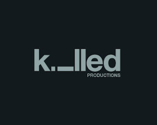


The top two photos are great examples of typographic syntax. Both use the "i" in similar ways to communicate two different ideas. They are simple, effective and don't rely on any illustration to communicate effectively. I make a big deal about having no added illustration because Mr. Goehner will make a big deal about it. Trust me. It will be clearer what I mean by saying not to rely on illustration if I give you a counterexample.

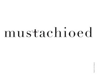
The bottom photo is an example of typographic syntax that communicates its point with the little curls on the "t." It's cute, right? But what would happen if you took the decorative curls off and just left the text? It wouldn't mean anything; it would just be a word. This is not what this project is about.

Typographic syntax is arranging the actual letterforms to enhance the meaning of the word. You can rotate them, stack them, make them varying sizes, replace letters with numbers or symbols or other letters. . . be creative! But if you are having to rely on elements added to the letterforms to communicate the meaning you should probably rethink your idea.

If you need some inspiration I suggest going to http://abduzeedo.com/tags/typography and looking at the Typographic Mania posts. Most of these are too illustrative for direct inspiration, but its creative typesetting and I think it's pretty exciting. 

Good luck!

Wednesday, January 19, 2011

Typography in Advertising—a brilliant solution

If you are like me, and like most designer I know, you are a typography nerd and snob. Bad kerning, poor font choices, papyrus, and font vomiting (excessive use of multiple font in one design,) really irritate you to the point of typographic anger. So, as we start Graphic Design 2 this semester, we will be focusing on using typography as a valuable design element to aid in the successful, and well designed, communication of a design’s intended message.


A new recourse, to help in your typographic design inspiration has emerged from a well established and familiar source—Communication Arts Magazine. If you are not familiar with CA, it is a bi-monthy magazine that focuses on design, photography, illustration, interactive design, and typography. Along with their regular issues, they also have yearly annuals containing professional work from all over the world. CA has a design annual (my favorite), advertising annual, interactive design annual, photography annual, illustration annual, and now, CA has released a much anticipate and very inspiring typography annual. The typography annual focuses on the excellent and creative use of typography in design and advertising.


When I received the new Typography annual, I was quickly distracted by it. I stopped what I was doing and was captivated by the typographic design solutions found within. One ad in particular really captured my attention…


The ad for Life Coach Gym, advertising their new SMS weight loss service, is brilliant. It uses a simple and engaging typographic concept for the solution utilizing the common SMS vernacular to connect with the viewers. Syed Asif Shah, the designer and art director of the ad, had this to say about the solution, “the idea behind this ad was to convey the message in a simple, innovative, and memorable way. We made a comparison between fatness and slimness using simple text-based drawings, which most people are used to using in SMS.”


The brilliance of the ad lies in its simplicity, clear and well executed concept, lack of clutter through the use of images, and its excellent use of color and composition. I love this ad because it uses only typography that clearly communicates the intended message, it is eye catching, and it is simply clever. The color is a good choice, however, I think any solid color with the same value would have worked as well. 


When a design uses a solid creative concept, with out being over designed, and has an element of cleverness, it is usually successful. I am always inspired by design solutions that use only typography in a way the engages the viewer as well, or better than, a design solution that relies heavily on images.