Tuesday, November 30, 2010

Anna Rose’s Post


The Ramones emblem is recognizable throughout the world.  Its unique to their band and sets them apart from all the other rock bands out there who favor using edge-y typefaces surrounded by skulls, snakes, blood, demons, and whatever else is considered “bad to the bone”.  The Ramones logo is very well designed. I really like it and think it fits the band nicely. With this logo they have created a following, a community who devotes time and money into their music allowing the music and logo to be known all around the world.

Despite the uniqueness of this logo to the band the design really isn’t that original. The band’s logo is a collaboration of the United States Department of Defense seal and the Great Seal of the United States of America, along with a few original ideas from the band (or their designer). 

So I want to compare the difference in these three emblems. The Ramones version the eagle is holding a bat in its right claw instead of arrows (like in the US. Seal). Also on the Great Seal the banner says “E Pluribus Unum”, whereas the Ramones’ says, “look out below”. The arrows the Ramones use above their eagle are a similar idea to the Department of Defense logo where they have stars in-between lines. The stars are also incorporated in the Ramones logo circling the whole emblem. Finally the flag banner in the Great Seal was replaced in the Ramones with a military type banner.

In the end I still think the Ramones have a great logo design, even though they heavily incorporated world-wide known logos. They did a nice job blending the three logos together to create a unique and easily recognizable logo for their band. 


Monday, November 22, 2010

Emily Anderson’s Post

Our soda company project is already finished, but the other day I found a soda company that I thought had a really good concept and design. This company is called "The Switch". This company started with a man named Mike. Mike loved to drink healthy orange juice. But he thought it was really boring tasting. So he always mixed his orange juice with sparkling water. One day he decided to make a company from his drink. The Switch drinks are 100% natural juice but carbonated like soda.

The Switch is all about people making "the switch" from unhealthy sodas to their healthy drink. They especially are trying to promote their product in schools.

I really like their logo. "The" has been flipped upside down, which I think is quite clever. It exemplifies the fact that The Switch is different, opposite from common sodas. The symbol in the background resembles the transpose symbol, signifying that The Switch should take place of other sodas.

Another fun detail is that all the bottle caps have words on the inside. If you collect the right combination, you can send them in for prizes.

I think this company has a great image. Everything they do looks fun and appealing. (And I must admit, the sodas taste really good, unlike normal juice drinks)

Thursday, November 18, 2010

Sara Taylor’s Post

There hasn’t been a lot of cool design in the medicinal world but I absolutely love these. The thing that grabs me most is the small compact size. I hate carrying around the normal tylenol bottle because the shape frustrates me and how it doesnt fit into my bag. The design of these are great. They're small and flat so you can fit them pretty much anywhere. I also like that they differentiate  by a simple boarder color change. It’s so simple but so effective. The short tag line “help. I have a headache.” fits well with the simplistic and clean nature of the design. If they had written a lot it wouldnt have worked quite as well.


Monday, November 8, 2010

Melissa Parkard’s Post


Based in Hood River, Oregon, Dakine was founded in Maui, Hawaii in 1979 by long-time surfer, Rob Kaplan.  Dakine quickly gained worldwide popularity through its first product, an innovative surf leash; which led to many additional surf related products. Dakine represents innovation, function and products that can be relied upon in the most ill-tempered conditions.  Dakine focuses on providing its customers with a full range of technical accessories for: Surfing, Windsurfing and Kiteboarding, Snowboarding and Skiing, Skateboarding, Mountain Biking, and other extreme sports.  In Hawaiian slang, “Da Kine” means “the best”.  The company has lived up to such a standard through its notably detailed design process.
Since researching effective branding and corporate identities the past few weeks, I have seen multiple examples of innovative and effective logos and packaging.  When reexamining everyday logos, for the soda label project, the Dakine logo stood out to me.  I use a Dakine brand bag every day and I have always admired the logo but it wasn’t until this project that I really examined what made the logo work. 
After researching Dakine products and labels, I learned that there are several variations of the logo.  However, there are two main versions; one is more feminine while the other is more masculine.  I enjoy the playful simplicity of the feminine logo design in particular.  The font choice is strong yet playful and elegant at the same time.  The way the ‘A’ and ‘K’ are connected creates a unique shape that is duplicated in the ‘E’ as well.  


I also think that the masculine version of the logo is a good solution.  The customize font, the strong lines, and sharp edges, communicate a strong presence.  The rounded edge on the ‘D’ and ‘e’ bring in the sense of the water or wind for the serf elements the brand stands for.  Overall, I appreciate the simplicity of both designs and feel that they communicate what Dakine is about.

Monday, November 1, 2010

Kristen Hanko’s Post

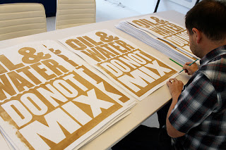
This design was made to support the restoration of coastal Louisiana and the Gulf. There are a limited-edition of 200 signed posters made by Anthony Burrill printed in BP oil from the recent oil spill disaster in the Gulf of Mexico. The poster’s message is clear and moving with the bold statement of “Oil and Water Do Not Mix.” The oil was collected from the polluted beaches of Grand Isle, Louisina and then screen printed by hand in New Orleans. Burrill comments that “There is a perception among many people that the oil in the Gulf Of Mexico is just going to somehow disappear...For people in the Guld, including Louisiana, the effects of this disaster will be around for a long time.”

I love this design for a poster because the artist thinks outside the box. Rather than just designing the poster digitally to make it look like oil and then printing it off, he uses the resources around him to create a compelling poster made from actual oil! He goes out and does the extra work to make his project the best it can be, spending hours on the beach collecting shovels full of oil and getting a little messy. Also, he isn’t using this design to make money, but is making this because it is out of his own interest and concern and then donating his time, money, and effort by giving all the profits to a voluntary organization: GulfOfMexico2010.com.