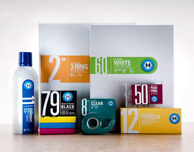
I was browing www.thedieline.com and I stumbled across this packaging.
What jumped out at me first was the super bold numbers. Just sitting there, staring at you, saying "oh, hi, look at me."
And you did. Didnt you? Thought so.
I honestly didn’t even know what the packaging was, but I had already seen the numbers, and they drew me in. Oh typographic syntax, you old dog.
So, as Demaris would say, I grabbed what I like to call the ole' reading glasses and investigated further. Office supplies. Really? I mean...office supplies? Thats awesome.
Something so super simple and ordinary with such awesome design. Definitely know where I’m buying office supplies when I need them.
Anyways, on to the actual design aspect of it. The solid color backgrounds of the packaging not only help explain the product without any typographic help, but they also allow for a clean base for the bold text to stand out from. For example, with the paper and pencils, both backgrounds suggest the product they're selling, while the packaging that says "BLACK" helps the text stand out with the use of a black background. As for the type on the packaging, the important words are bold and stand out well; WHITE, PUSH PINS, PENCILS, ADHESIVE, etc etc.
I love the simplicity of this and the clean execution of the minimalistic combination of type and solid color palettes.


No comments:
Post a Comment