
Design: simple, clean, to the point. I am an avid tea and coffee drinker. Consequently, I can’t really help but be a connoisseur of unique mugs. This brand is one of my favorites. Not only is the mug itself designed well (with a lip and comfortable handle), but the printed design is terrific as well.
Simplici-Tea

The design is simple. It is straight forward, and it is clean. The single line of text against the white background makes the word pop and grabs the attention of the consumer. Also, the typeface is thick and curved, matching the shape of the mug itself.
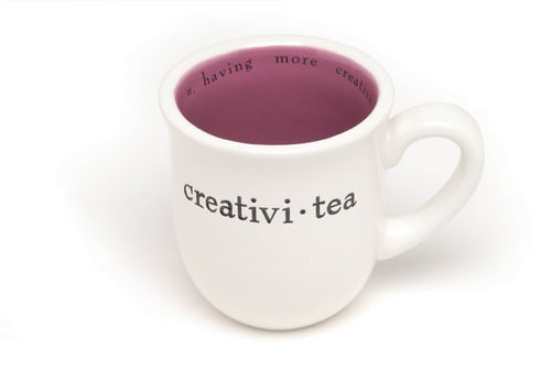
Splitting words often makes it difficult to read. At first, it was hard for me to know what the mug “Hones-Tea” said. I had to give it a couple of glances and pronounce it differently in my head like in the game Mad Gab. (Now I just feel dumb for not getting it at first!) Evidently, the designers sought to alleviate any confusion by placing the definition along the top rim on the inside of the mug. This is very helpful to the consumer. More importantly, it is just good design.
Par-Tea

In order to distinguish between the mugs and add some more pop to the collection, each kind of mug is painted on the inside with a different solid color. This adds color, individuality, and brightness to the mugs without overpowering the crisp, clean design work.
Creativi-Tea
The packaging for the mugs is not a box, but a tea bag. How creative! Each mug is placed in one of these clear, tea bag shaped packages with a tea tag stapled to the front. There isn’t one thing about this package that was not designed intentionally and with much thought. Alina Wheeler said it well, “Design is intelligence made visible.” As I sip on my cup of tea, I know this is good design, because it incorporates creativity with simplicity. Also, it is fun with the added color but far from overpowering.
One last thought:
As a designer, remember that creating good design is praiseworthy; however make sure at the end of the day to have a little humilit-tea…er, a cup of it at least.
[s]


I really enjoyed this post! The splitting of words didn't pose a problem for me per say, but I think allowed me to grasp the dual meaning rather quickly without too much work. The simplici-tea was my favorite and really drove home the idea that a complicated idea isn't always going to be the best choice. I think it's time for some hot tea myself!
ReplyDeleteThese are so cute Sarah! I really do like the design in general, with how the words are arranged. The simplicity (no pun intended) of it all is impressive because it is so simple, but because of how clever the words that are on the cup are, the design works well, to not overpower or be over designed.
ReplyDeletePersonally, I don't drink hot beverages. But that doesn't stop me from appreciating the excellent design of these mugs. My favorite part is how they added the definition along the inside rim. It shows that good design shouldn't just stop on the outside, but be considered in every aspect of the final product.
ReplyDeleteI love the design of these mugs! I like how simple the words are and how they split them up. I also like how they thought of the packaging for the mugs being in a tea bag. I like the simple colors of black and white on the outside then the pop of color on the inside. The mug overall was well thought out and designed really well.
ReplyDeleteI totally just sat here for 5 minutes trying to figure out what 'Hones-Tea' meant. We can feel stupid together.
ReplyDeleteI love these designs. Love. Like enough to go out and buy all of the mugs right now. Like you, I am a huge tea person. The design is so simple, but incredibly ingenious. This really is a great example of making 'intelligence visible.'
These mugs are amazing! Do you know where I can buy them?
ReplyDelete