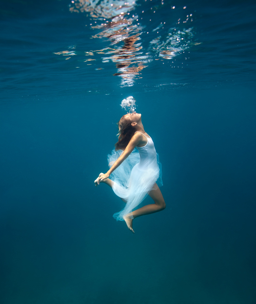
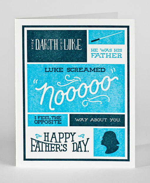
If you're ever needing some inspiration, or just want to admire some incredible graphic design/photography/motion graphics/etc, head over to www.fromupnorth.com. There are posts nearly every day categorized but what type the are, such as photography or illustration. Within these posts you'll find various images, and to see the site they originated from you can (most of the time) simply click on the image. Here's a few examples of the work you can find on the site:


I really like this site! I like how it is not just focused on one field of visual arts because for me after a while all photographs begin to look the same. This is a really clean, well laid out site that really offers a lot of diversity. I will be using it for future brain storming! Thanks for the link!
ReplyDeleteI like this website! I will be referring to it when I need some inspiration!Its nice how it has a little bit of everything. From type, photography, illustration, to sifi. Very cool Matt!
ReplyDeleteGreat reference. I really like how a lot of the pieces have a photographic element tied into them. I think that the mixed media pieces that integrate photography with things such as pen and ink, water color, acrylic etc. are really creative. It adds a more original/personal aspect to the work.
ReplyDeleteGrady Truitt
Great website Matt. I agree with Parker; its refreshing and inspiring to see so much diversity here. I especially enjoy that it pulls in "fringe" visual arts like architecture too. I think there is a lot to be gleaned from this site. Bummed around the logotype, typography and advertising pages for a bit. Of the examples you placed here, I think the bottom two are my favorite. Like Grady, love that mixed media and I always appreciate nice type.
ReplyDeleteLike Chase said, I think it's really interesting to look at some of the "fringe" art, especially when you're looking for inspiration. I looked through the street art specifically, which was incredibly interesting, especially the ones that incorporated a 3-D aspect. Awesome place to go to when you're stuck on a project and need ideas : )
ReplyDeleteI like to get inspired by other people art work, but as Todd said in class I think is important to create your own style, your own art, and don't copy!!!!!! JP Garcia
ReplyDeleteWhat a cool site! I love the variety! I will totally be using it for inspiration. Some of the product design stuff is hilarious and so creative! I also love the typography section, some of them are hard to read, but others are so creative!
ReplyDeleteI really enjoyed looking at the variety that the website provides. All of the work is so unique as well as creative... in other words, it's a perfect thing to be inspired by! The ones that are funny were also fun to look at. They provoked my thoughts of a different direction that design can go.
ReplyDeleteNeat stuff. Just looking around and next thing I knew I'd spent an hour. I was especially intrigued with the motion graphics from 2011. As everyone else has noted it is very inspiring to look through this stuff. Some pretty amazing Photoshop stuff to.
ReplyDeleteOf the stuff posted, I responded the best to the last image. All of the typography fit with the composition and it looked really nice. By and large, I feel like I lean toward more simple designs.
ReplyDeleteI love the level of diversity in these pieces of work. Also, I appreciate the combination of elements - especially the use of photography and photoshop - but some of them were a little too busy for my taste.
ReplyDeleteThis is awesome. The photographs are so inspiring! I love the first one. It really portrays a sense of serenity. The last one of the poster is really well done. Thanks for sharing the site!
ReplyDeleteThe design of the last one catches my eye the most. It has a very clean feel to it, combined with a graph like system that leads the eye through each image. Not only that, but the content is just awesome. Even though it is just a three color scheme, the way it is applied makes it very dynamic and full.
ReplyDelete