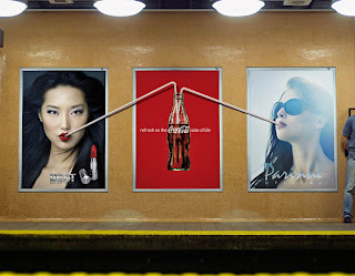
Coca-Cola has been around for a long time, and I’d say that it’s pretty much impossible to not know the product. I think that the ad really plays on a we already know. What I really like about these series of ads is that you get a real sense of the object in 3D space. You can blow up a picture of a soda bottle and put it on a billboard, but most times it’s just a flat image. No matter how dimensional the image is it’s just an image trapped in a box that is designated for a product. What makes this series of ads different is that they break out of the box, and engage other pictures, and the surrounding structures. The artwork is so superbly done, that I can’t tell from just a picture of the ads where the art of the straws end and the real pipes begin, if in fact those pipes are real and not just an extension of the poster. The ability of these Coca-Cola ads to escape the normal ad box that ads are often relegated to serves the ads well. What I think is really important is that unobtrusively engaging the environment, and in turn they really grab the attention of the viewer. I am a very cynical and cold when it comes to advertising, I generally try to ignore ads, and unless they are really well done, I mentally gloss over them.
I know that a lot of times that companies will get your attention by just bombarding the same image or slogan, and you’ll “get” it, but you won’t appreciate the ad and product the ad is selling because you were pretty much forced to acknowledge its existence. Like when a station runs the same add over and over, on every commercial break. You may acknowledge the ad, but you will often come to loath the product being pushed, because you were bored and bombarded into hate for said product. This ad has your generic slogan that you expect from any beverage ad, but the way the straws act like spider’s legs, getting outside of the picture, draw you to the ad, non-brutally engaging you. The ad with the straws going from one poster to the next, I’d like to call meta advertising, for whether those other two brands might be real or not, your interest lies in the central poster that is breaking out of the box.I’m not sure what else to say, I think that these posters worked well to capture the attention of the viewer, and really stand out compared to a lot of other ads that are out there; (at least until this style gets imitated to death, and the advertisers move on to the next best advertising scheme that the general populace has not gained an immunity to yet).


No comments:
Post a Comment