We have discussed in class the sad truth that Christians are usually behind when it comes to visual art. Well, I am always encouraged when I find some good art being used by churches and other Christian organizations. It s not very common but it does occur and I would like to share a few examples of my latest findings. Here are a few church websites that I think are very well done and contain a lot of good graphic design. Have a look and let me know what you think. Are some Christians starting to put more effort into good design? Are these examples of good design?
Saturday, March 31, 2012
Friday, March 30, 2012
Sierra Alexander’s Post
I recently hit a wall during a project and I was looking for inspiration as well as just an outlet for creativity when I stumbled across this website, Thinkdesignblog.com. I was impressed with the diversity of designs, mediums, artists and "freebees" they had. The first page has several different "inspiration" posts for prints, graphic design and web design, there are also artist interviews and some some fun textures that you can download. I struggle with finding an interesting textures but I was able to find a few that I liked and will be able to use in the future whether it is for graphic design or photography.
Simply flipping through the different posts help relieve the creative block I had and it also helped bring about different ideas that what I had not previously considered. I think that it is a neat little tool for remembering all the design options out there, or at least a pleasant break from a current project.
(P.S. Though there are some cool stuff on the page face, the goodies are in the archives so be sure to browse there!)
Wednesday, March 14, 2012
Sarah Bladdick’s Post
During my research for my Information Design Project, I found this series of posters designed by Jim LePage and was truly blown away. LaPage decided to dedicate 66 weeks to make a poster for each book of the Bible. The posters have a really cool feel to them. They are all different, but at the same time it is very evident that they were all created to be part of a set and go together. After looking at these, I couldn't help but think that these would be really cool to put in a Bible before each book sorta as a introduction page to each new book. I really like how each poster takes from the book to create an abstract discription of the book on the poster. Super cool! Ya'll need to check it out! Here is the link: http://marketingjesus.net/graphic-designs-of-books-of-the-bible-that-inspire/
Tuesday, March 13, 2012
Savanna Seliga’s Post
We have all encountered Informative posters that are extremely boring. As Designers it is our goal to communicate information in an appealing/creative manner. Like we have learned in class, the information is the most important part of “Information Design.” Therefore, the material should be both easy to read and visually pleasing to keep the audience’s attention. The facts must be correct and constructed effectively throughout the poster. Here are some informative posters I have found that work very well.
I liked the friendly style these posters generated. They were enjoyable to read and evoked interest I probably wouldn’t have had without the artistic design. A traditional poster about “left and right Government” would have never kept my attention, but with this one, I actually followed it all the way through. I would have to call it a successful poster. The vibrant colors and fun shapes captured my attention in both this poster as well as the others. “The Digital Dump” poster had the same effect.
The website I found has a ton of super good inspiration for our own projects.
For more posters such as these go to:
Saturday, March 10, 2012
Jose Garcia’s Post
I found a fun game for you (http://type.method.ac/).
Instructions:
Your mission is simple: achieve pleasant and readable text by distributing the space between letters. Typographers call this activity kerning. Your solution will be compared to a typographer's solution, and you will be given a score depending on how close you nailed it. Good luck!
They are the actual instructions of this game. I think, it is a great game.
We as designers, we have to deal with typography in our work, so this is a great game to challenge your kerning sense.
Wednesday, March 7, 2012
Looking back at our logo design project, I was reminded of two interesting articles on branding I stumbled upon last semester.
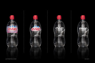
The first comes from thedieline.com and looks at brand distillation. We talked a lot about simplification during logo design, that good logos need not and often should not be overly complicated or contain a lot of fluff. Simple logos cut production costs and ease application across a variety of mediums. But what this article looks at is how far can you simplify a logo and still maintain the emotion, connection, and message it was designed to convey. This is like an extreme version of what we do when we check readability in B&W and diminished sizes. It is also interesting to note the role that iconic packaging (which is a form of design) plays in this experiment and the recognition of name brand products. What do you think: what about these logos makes them so recognizable even in butchered, piecemeal form? Is something lost when these logos are reduced? At what level does the logo serve its purpose best?
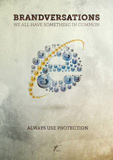
The second article comes from awwwards.com and is an experiment called “Brandversations” which looks at logo and brand durability by morphing two competitors’ logos together. What do you think: does one logo overpower the other? Is the essential and basic form of each logo strong enough to preserve the message and identity of the company when a close competitor’s image is heavily impressed?
Grady Truitt’s Post
For any designer, I think it is important to have a way to present your work to clients. Though you could have a portfolio on Facebook or Flickr, I believe that the best way to present your work is to have your own website. Every deigned should have a website that they can use to display their work and advertise their business. Because the website is part of the business, I think that it is important that the website is specifically designed to display your work in the best, most appealing way possible. I believe that the design of your website is just as important as the work, because clients won't just see the website as a way to display your work, but as a piece of work its self. The better designed the website is the better it is for the business.
Here is an example of a website that I thought was very well designed. It really stood out to me because of the little details that were payed attention to. I think that this company did a very good job at promoting the quality of work that the business is capable of.
Do you know of any well designed websites that you want to share?
Tuesday, March 6, 2012
Sierra Parker’s Post
Since we are currently working on posters I was browsing the web and came across a couple posters that I thought were done very well and a one that needed a little tweaking.
The first one about breast cancer with the hand caught my interest because like the adoption/abortion poster shown in class, the word beat and breast are only two letters apart. I think that the simplicity of this poster not only catches and holds attention but is creditable because the hand as a picture is more relate able than if it were a drawing or other graphic. I also like the one with the spurred running shoes because the western style is a more light hearted and an active approach to being aware of breast cancer. I like how the designer used the play on the word 'run' for two calls of action, the first being the race for the cure and the actually effort of running in a 5K race.
The poster that I thought had slightly missed the mark was the race for diabetes. It is very busy and it took me a while to find out what it was for. There is a lot of information on the poster that is needed but because there isn't a direction for the eye to follow it appears confusing and busy at a glance. I like how the word "run" is larger than the rest because that is the call of action, I just wish that there was a stronger more apparent indication as to what they are running for.
Subscribe to:
Posts (Atom)


.jpeg)

